
Philadelphia vs Kansas City: which model performs better?
In our last post we explored how to evaluate urban model predictive performance. In this post we compare model performance for the Kansas City and Philadelphia metropolitan areas, in honor of their upcoming Super Bowl matchup this weekend. Sorry but you won’t find any betting tips on the game here - just some fun comparing models for the two regions.
Let’s start by comparing how well the test model predicts in both regions. The model we are using is an experimental one, although both regions actually do use our models for their regional planning. In order to keep the game on a level playing field, we’ll use the same variables and specifications for both regions, but train them separately on local data for each region.
Assessment 1: Simulate 10 Years and Compare to Observed Data
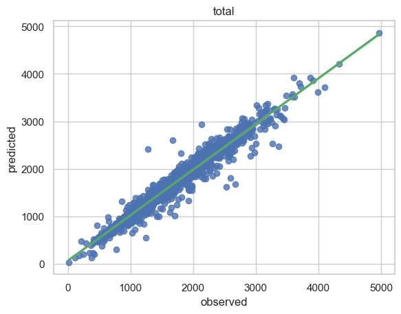
The scatterplots comparing observed and predicted households by census tract after a 10 year simulation from 2010 both look very good. No sign of bias in either one.

Kansas City Region: Predicted vs Observed Households by Census Tract in 2020, after simulating from 2010 at the Census Block level.
Philadelphia Region: Predicted vs Observed Households by Census Tract in 2020, after simulating from 2010 at the Census Block level.
Let’s see how the Pearson correlation coefficient between the observed and predicted values in 2020 compares.
The correlation between predicted and observed households in 2020, after 10 years of simulation, is 0.974 for Kansas City, and 0.977 for Philadelphia. So give a very slight edge to the Philadelphia Eagles on this one.
Assessment 2: Simulate 10 Years and Compare Changes Over the Decade
Let’s see how the model is doing with regard to predicting the amount of change from 2010 to 2020 by census tract in these two contenders.

Kansas City Region.: Comparison of Predicted Change in Households from 2010 to 2020 to Observed Change by Census Tract.

Philadelphia Region: Comparison of Predicted Change in Households from 2010 to 2020 to Observed Change by Census Tract.
Looking at the comparison of observed and predicted changes in households by census tract in these bar charts seems to give Kansas City a slight edge over Philadelphia, something that is also evident in the kernel density plots below (note the larger difference in the peak values in Philadelphia).

Kansas City Region: Observed and Predicted Change in Households by Census Tract form 2010 to 2020 as a Kernel Density plot.

Philadelphia Region: Observed and Predicted Change in Households by Census Tract form 2010 to 2020 as a Kernel Density plot.
For Kansas City, the correlation between predicted and observed household change was 0.734, and for Philadelphia it was 0.652. Slight edge to the Kansas City Chiefs on this one, although both performed very well.
Overall, both models seem to be performing at an exceptional level, as one would expect from Super Bowl contenders. Looks like this one will come down to the wire. Looking forward to a great game! Go Eagles! Go Chiefs!